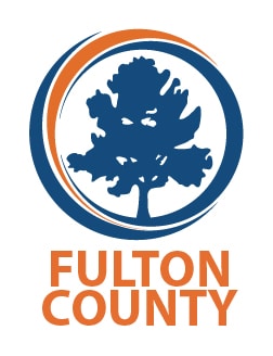
Fulton County began 2019 by unveiling a new logo. This is the first branding update undertaken by Georgia’s largest county since 1989.
Adopted by the Board of Commissioners in October of last year, the identity refresh includes a redesign of the County’s oak tree logo featuring fresh design elements and a new color palette emphasizing blue and orange. The logo and rebranding efforts were developed by county staff.
“Fulton County is a big deal. It’s important that our logo reflects a community that us a leader in the region nationally and even internationally,” said Fulton County Commission Chairman Robb Pitts. “We have a great team doing great things, and it’s time for a fresh image.”
“Citizens will see a refreshed Fulton County brand that looks forward into a future that is focused on service,” said Fulton County Manager Dick Anderson. “Importantly, this branding was completed with internal resources to minimize taxpayer investment.”
The new logo retains the County’s long-term symbol, the oak tree, as a symbol of strength, growth and dependability. The Fulton oak symbol dates back several decades and has seen many iterations. According to a news release by the county, the oak is now surrounded by an open circle emphasizing Fulton County government’s goals of inclusiveness and transparency, with curves inside the circle denoting forward momentum.
Over the coming months, the new branding will be phased in across the organization, in signage, printed materials, and all other visual communications. The redesign will also inform elements of the redesign of Fulton County’s new website.
Thom Chandler
The Georgia Sun is a news and infotainment website devoted to all things Georgia.


